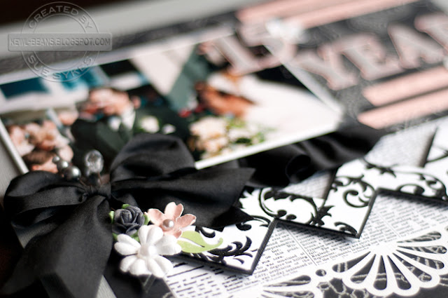
Here's my layout:
Supplies list: Bazzill and DCWV cardstock; Robin's Nest patterned paper; Martha Stewart Crafts, EK Success and Kreaxions punches; Cricut die cutting machine and Songbird font; Prima and miscellaneous flowers; unknown pearl halves; May Arts ribbon; Maya Road trinket pins; Canson photo corners; Cosmo Cricket letter stickers; Heidi Swapp chipboard heart.
Journaling reads:
5 jobs, 4 cities, 3 homes, 2 children and 1 heart attack. 15 years later and I still love you as much as this day...
Wanna know a little secret... sometimes, I will come up with the layout before I come up with the sketch.
I can hear you gasping from here. But I'm just keeping it real, people. AND because I spilled the beans at the Younique girls' weekend so I wanted to confess before the word got out... LOL!
That was the case with this one. I completed this layout for a DT assignment - it just sort of flowed, as I moved paper around. But here's the funny thing.... Often in my spare time, while I'm waiting for the kids' lessons to finish, I will randomly sketch layouts. In particular, I have two sheets full of sketches (20 to a page) that I completed a few months ago that were tucked in with my DT assignments calendar.
So, when searching through my sketches for a March 2013 sketch, wouldn't you know it? I sat down to review my calendar and found the sketches. And found this:
Isn't that weird? It's almost exactly like my layout, right down to the folded chevron! (Which, by the way, I've been wanting to try ever since Jayme posted her tutorial on the CS blog) So I decided to use it for the March sketch challenge instead... :)
Here are some detailed shots:
The May Arts ribbon is BEAUTIFUL to handle! To make the ruffled edge under the photo, I took a length that was about double the length of the photo. Using needle and thread, I made a running stitch across the top of the ribbon (you could also use a basting stitch on your sewing machine, but I didn't have one available at the crop!) I then gathered the ribbon until it was the length of my photo. I attached adhesive to the bottom back edge of the photo and attached the ribbon, adjusting gathers as I went. I then tied a large bow and attached the whole thing to my layout using dimensional foam!
Okay, now it's YOUR turn! Head over to the Sketchy gallery and get inspired to create your own layout! You can use the sketch as is or as a springboard for your project - the choice is yours!
{RAK ALERT!}
If you play along with the sketch this month, upload your layout in the gallery into the March Sketch section here, and then using the linky tool below, add a link to that layout, by 11:59pm on March 31st, 2013. On Apr 1st, 2013, I will randomly draw a winner from the comments here of those who participated, for a prize!
**NOTE: In order to qualify for a chance to be published in an upcoming issue, your layout must be posted in the online gallery by MARCH 31st To win MY prize, you must add a link to your layout BELOW using the InLinkz tool.
Cheers,
P/S: Don't forget about the other challenges on my blog for a chance to win:
Leave Your Legacy: Embrace Change (deadline: May 31/13)
It's a Sketchy Challenge: February 2013 (deadline: Mar 14/13)
It's a Sketchy Challenge: February 2013 (deadline: Mar 14/13)


beautiful!!!!
ReplyDeleteThis is stunning Sue! I can feel the love that went into this special layout!
ReplyDeleteA stunning page, Sue! The black and white combo is so beautiful and elegant!
ReplyDeleteGorgeous layout. Love all the details, especially the pretty bow. The b/w papers are perfect.
ReplyDelete