I also picked up paint swatches. I love love LOVE the colour of my office now and may just repaint it the same colour, but I'd love some input from you, my lovely readers... I think I am going to get the Expedit bookcases from Ikea in the black-brown colour:
What paint colours do you suggest? As much as I love a neutral palette, I want to stay away from taupe - our entire house is all practically that colour as it is, aside from the bedrooms, toy room and office. I think I would like to mix the dark woods with white and another colour - maybe red? But I don't have an OTT light (YET!) and need a colour that won't cast onto my working area.
I came up with two palettes that I like:
Classic
Colourful:
I'm leaning towards the Classic - my thoughts are that the bookcases would be the dark brown, the walls would be pale apple green and the boxes, accents, etc. would be red & white.
Not quite sure about the second palette but the colours made me happy! :)
Can't wait to just get it done so I can get scrapping again! For now, here are the ones completed but not yet shared:
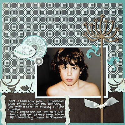
I love this photo of Connor, taken on his birthday. Journaling reads: "Sure... I could have taken a traditional photo of you on your 8th birthday - one with a cake or blowing out your candles... But, I chose this one - which is just so typically you at this stage in your life - something I want to remember!"
I'm not crazy about this one but it's another one done, I suppose... Top photo flips open to reveal journaling about how the subdivision around my parents' house has changed since the late 70's when this photo was taken.
Connor went through this phase of giving "raspberries" - these photos were taken when my entire family went to Mexico - my parents, sisters & their families, included.
A favourite photo of mine, this layout is transparent - that's my deck you can see through it! Now you can see why we have to refinish our deck... I coloured the Luxe transparency with Stickles for some sparkle.
Thanks for reading!


I like the classic color combination - I actually have an apple green in my office with the white expedit bookcase right now. Just had to add though that that expedit bookcase is awesome, particularly if you have AC 12x12 albums. They fit perfectly - which is the main reason I bought it since I had no where to store my albums. I just got it a few weeks ago and am so glad I did. I might eventually get a couple of the larger size (like you posted) for our living room. (The one I bought for my office is a 2 wide by 4 high).
ReplyDeleteI want several of those bookcases, one for my scraproom and one for my daughters room, she will get it first. I like the classic colour combination better...my room is going to be orange with white and fushcia. I just have to sell the furniture in there and convince DH he wants to. LOL
ReplyDeleteI like the transparency layout..that is very cool.
I too like the classic colour combo. And I have those same shelves in my home office (not my scrapbookng space). One of the things that is super about these shelves is that you can get little red cupboards and drawer units that fit in -- and I think they might be the right shade to match your classic colour scheme.
ReplyDeleteBTW, I keep my middle shelf somewhat empty and use it almost like desk space -- it holds my pens, pencils stapler and what not and helps me keep my main workspace free of those things.
Looking forward to seeing the final product.
i like classic. you might get tired of the pastel pink/blue in the other combo. are you moving rooms too or just re-doing your current room?
ReplyDeleteI love that shelf from Ikea.. I like the dark brown colour as well.. I really like your layouts.. such great inspiration
ReplyDelete