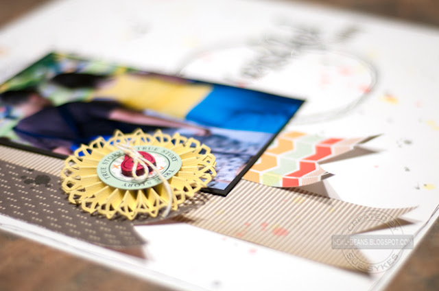
You may recall from last month's challenge that the purpose of this challenge group was to take our scrapbooking to the next level, to stretch our creative process and to grow as artists by embracing challenges that make us think, work and grow.
This month, our challenger was the very talented Lisa Moen. Lisa, like most of us, doesn't always take the "perfect" photos. In fact, sometimes, the imperfect ones are all you have to tell your story. This month, Lisa challenged us to use those imperfect photos to tell an story. Here's what she had to say about her challenge:
"I was digging through some old 1980's photos the other day and realized how bad some of the pictures were. Cameras have come a LONG way since then!
I have lots of pictures I haven't scrapped because they were/are poor quality pictures and I am sure you have pictures like that too. So let's dig out those blurry, bad pictures and tell the story behind them! My challenge to you this month is to use a bad photo and journal about it."
I thought this would be a challenge for me, because while I take as many blurry photos as the next girl, I usually delete them right away! But in flipping through some printed photos, I found a photo that I had saved. And just looking at it, and knowing the story behind it, makes it special! It's really blurry due to camera shake, because it was a scene that my dear friend, Amanda, and I happened upon, on our walk back to the car after a long day at Niagara Falls.
{Please excuse the wonky photo - I finished this late last night and wanted to photograph it then for an early morning post! I will re-shoot it and re-post later today!}
Supplies used: Bazzill cardstock; My Mind's Eye and Echo Park patterned papers; Martha Stewart Crafts punch; My Favourite Things Dienamics die; October Afternoon diecuts and brad; Doodlebug Designs and Lily Bee Designs alphas; La De Da glitter; 7Gypsies mini paper clip; FineTec watercolour paints; American Crafts metal tag; Glue Dots; Sharpie pen; thread; miscellaneous library card, button and twine.
I stapled the OA tab to a library card from my stash and added a border to help it stand out, using my red Sharpie. To keep the journaling card from sliding down, I attached it to the photo using the mini paper clip.
Journaling reads:
Niagara Falls ~ Jul 2012
When the Lepage family came to visit, Amanda and I knew that Connor and Renee would hit it off - similar interests and personalities, same age... After catching them in the back seat with their heads together, on the ride up to Toronto, we joked about how great it would be it they ended up married - we'd be related! So after seeing them walking ahead of us, close together, I knew I had to grab the moment before it was gone. Hence the blurry photo, but the memory - and the wishful thinking - is crystal clear...
Here are some more detailed shots:
Thanks, Lisa, for the challenge - this is a photo I would have otherwise passed over, but a memory that I definitely want to remember! After all, who knows... ? :D
I hope you will stop by and see what the other designers on this adventure have created:
Lisa Moen
Laurel Seabrook
Cathy Harper
Sue Sykes
Lisa Spiegel
Joanne Burton
Ann Jobes
Laura Whitaker
Audrey Yeager
Laurel Seabrook
Cathy Harper
Sue Sykes
Lisa Spiegel
Joanne Burton
Ann Jobes
Laura Whitaker
Audrey Yeager
If you decide to play along, leave a link to share your design - we'd love to see what you create!


Love what you did with this challenge Sue! The story behind the photo is perfect and so glad you have it down on a layout! Awesome page!
ReplyDeleteWhat an awesome page and photo, love the medallion! All the pen work and the awesome stitched circle really make this pop! Love it!
ReplyDeleteThis is an amazing page Sue!! Wow! I love it!!
ReplyDeleteI love the story behind your photo, Sue, and am so glad you shared the journalling in the post. I love that the pennants aren't pasted down and those tips just kind of curl and add dimension. That little cluster in the lower right adds the perfect balance to your terrific design.
ReplyDeleteI love that your blurry photo actually shows movement. And your stitched circle is perfect grounding. Beautiful page!
ReplyDeletegreat layout to remember the funny way we like to think ahead and hope for something in the future. love the stitching and misting!
ReplyDeleteWhat a great layout. I love the background. The colours are so soft and subtle. Beautiful!
ReplyDeleteWhat an awesome challenge...and a fantastic layout was the result! Thanks for sharing, Sue :)
ReplyDeleteThis is such a great layout with perfect balance. I love the paint splatters, the stitching and the story behind the photo! Just awesome!
ReplyDeleteJoanne xo
Great story and gorgeous layout!
ReplyDelete